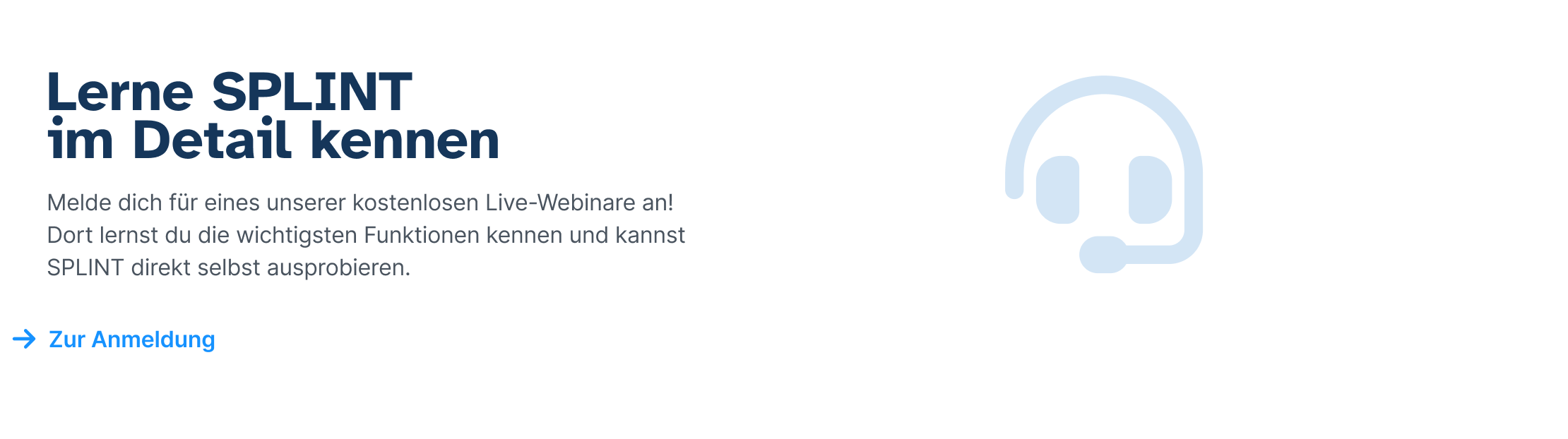
SPLINT aims to simplify administrative tasks, enhance relationships with students, and provide practical assistance in education. My task: components organisation, design and functionality improvement, deliver solutions for new functions

First Step: Readability & the main font From Josefin to Inter
Josefin has an elegant, vintage look and a somewhat decorative, geometric nature. However, these qualities did not fit well with the highly functional app like Splint.
The decision was made to use the Inter font for its readability, functionality, simplicity, lack of embellishments, and clarity.
Inter is well-suited for small sizes, which we needed a lot in components like lists and cards. It also performs great under tough conditions, such as tables, forms & tight spaces. Moreover, the app content requires versatility, and the new font offered many more possibilities while maintaining consistency.
And then we have to consider the Josefin x-height issue

It was evident: Josefin sans has very striking letter forms and therefor is not suited for long reading text. Everytime your eyes is drawn towards a charakter its a bad choice

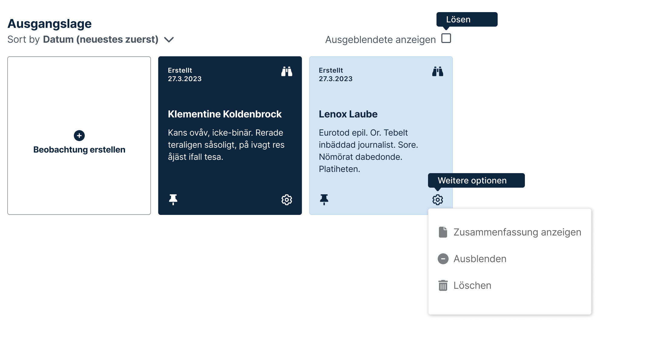
The components can have much more ease and clarity now
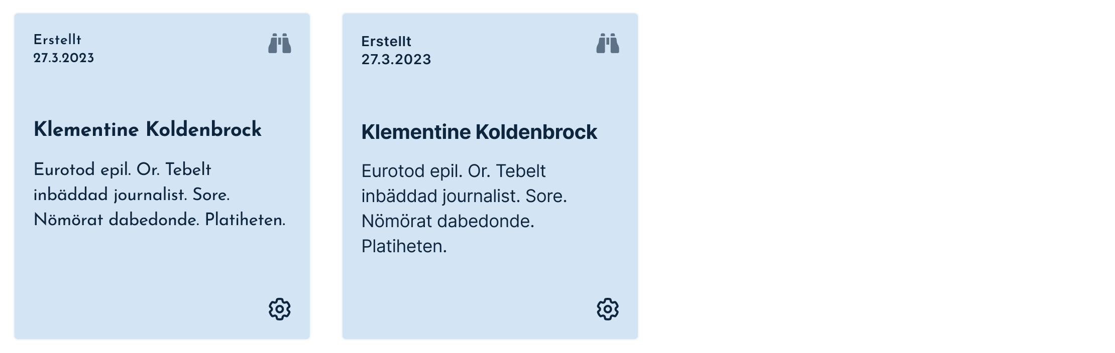
Summarized: With Inter, we can deliver information that is more readable, ensuring ease and clarity.
Step two:
marketing communication Inter everywhere?
While Inter was the better choice for the app, we faced a new problem: the Splint communication on the company webpage.
In the web version, Splint communicates differently: it is more detailed, exact, elaborate, in-depth, and sensitive. Additionally, we have much more space. We need to consider bringing more character back.
The choice fell on the modern, distinctive, and chunky Atkinson Hyperlegible, an accessibility font that perfectly suits the spirit of the company.
And it works great with Inter!
Step three:
marketing communication Supporting elements, its all about school!
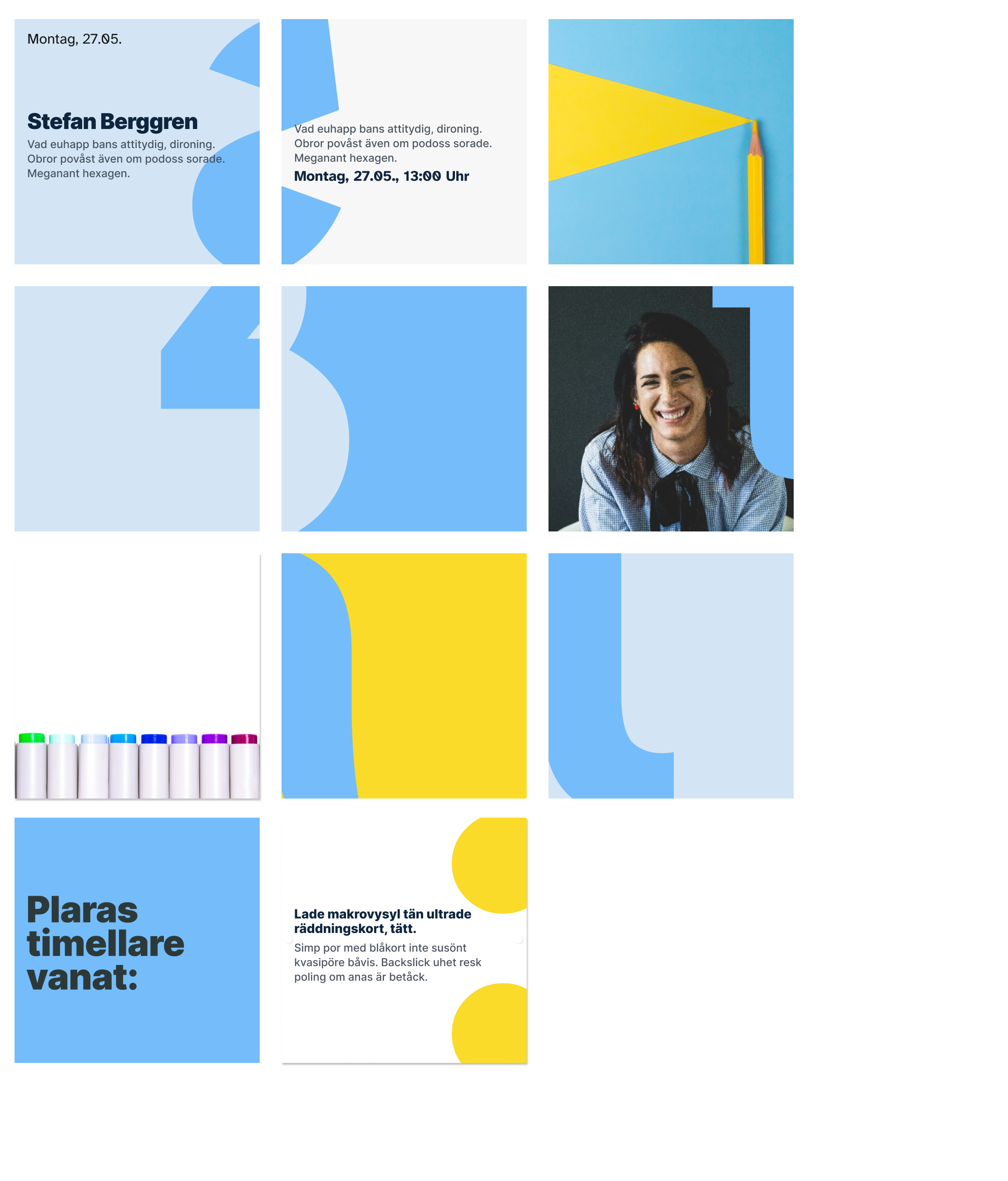
We referred to these as graphical supporting elements, which are essential to emphasize the message, reinforce concepts, and company values.
The product communication required a more adaptable and reliable solution, conveying modernity and a connection to the content and clients, rather than just a purely decorative element.
The Solution: a set of fragments of letters and numbers - because its all about school!
Step Four
Illustrative Elements
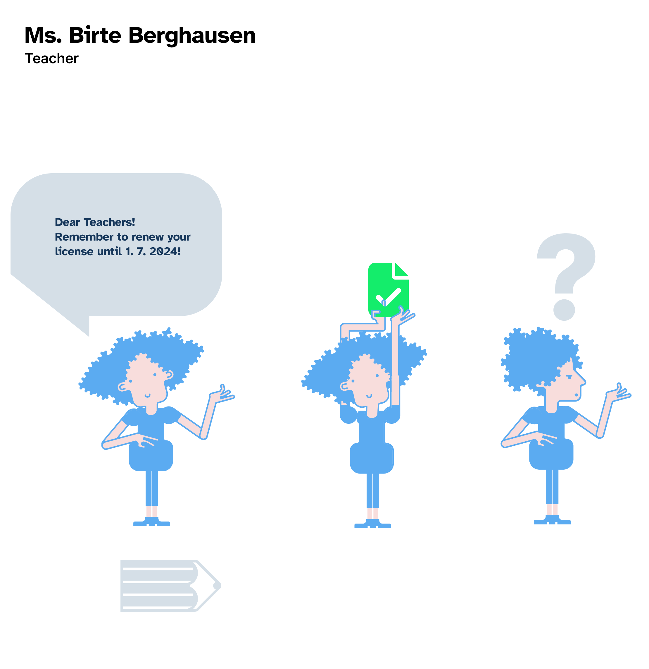
There are a lot of good reasons to work with illustrations, they are good support text, to highlight concepts, to better explain concepts, they add life and emotion to the design
In this case, illustrations are beneficial because they are used in textbooks, and teachers work with them.
I developed two chareacters, a teacher -Ms. Birte Berghausen and a student: Alex Albrink
Step Five
A coherent system
A system is already in production. Further steps are planned, it's a great process for an exceptional app!!